
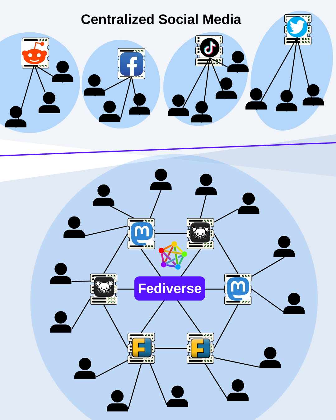
What do you think about this graphic?
It should give an easy overview of the architecture of the Fediverse and what it differentiates from old social media.
What do you think about this graphic?
It should give an easy overview of the architecture of the Fediverse and what it differentiates from old social media.
For the top services, I’d make each of the blue background circles a different color to better denote that they’re proprietary and incompatible.
For the Fediverse section, you could add Tumblr, and other services who also federate via activity pub to show our interoperability and expansive reach.
Is it already working?